Your Monitor

... is out of adjustment
(rev 8 January 2004) Monitor Brightness and Contrast are seldom set correctly, and many web page graphics created on a misadjusted monitor won't show up well on other peoples' screens.
This is especially true for web graphics created on MACs, where monitor brightness is set to replicate the printing industry paper-white background. This would be fine, except for the fact that 98 percent of the world uses monitors set to a much lower brightness.
Changing the settings can be accomplished by twiddling with internal and external controls on older monitors, with on-screen controls of modern monitors, or with the display utilities of the Operating System.
For Windows 95 and Windows 98 select "Settings, Control Panel, Display, Settings, Advanced, Color, Target Gamma."
For MAC System 7.5 or OS 8 select "Apple, Control Panels," for System 7.5 follow with "Monitors, Options," for OS 8 select "Monitors and Sound." Lowering the gamma will often suffice with MACs. System X, which is a Unix Mac OS, allows something like "make it look like a PC."
A first look
(Added January 2004) The HTML-4 specification allows setting cell colors in Tables. Thus the following can be constructed (and seen by you if you have a more modern browser): It is a set of 8 cells, showing left to right the nearly full range of greys of RGB values (hex) from 000000 (solid black) to ffffff (complete white). [Note: This will only work if you have "background colors allowed" or "let webpage set colors" set in you browser preferences.]
| black black | 222222 222222 | 444444 444444 | 666666 666666 | 888888 888888 | aaaaaa aaaaaa | cccccc cccccc | eeeeee eeeeee | white white |
This is an rough overall check of your monitor's settings. Any cast must be attributed to the monitor's base color temperature setting. The background color for this page is eeeeee. The cells above are 12 percent apart, except the last, ffffff ("white"), is 6 percent more than eeeeee. You might not be able to distinguish between the blacks of the first three cells. But certainly you can tell apart the whites of the last three. If not, it is time to start twiddling knobs and settings.
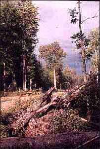
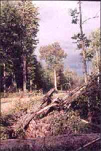
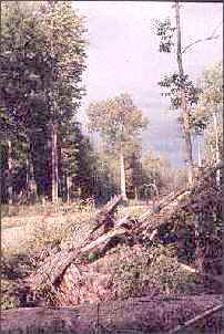
The test for the above images is to inspect the shadows for details (can you see things down to the grain of the wooden log?) and to look at the sky and be able to distinguish clouds nearly everywhere. In addition, the blacks of the trees should be a solid black, and the few white patches in the sky and among the trees should be a bright white.
The difference in gamma in the images is an increase of 40 percent between images, from left to right. Don't panic, although there is a wide variety in how monitors respond, and in viewing conditions, it is easy to adjust.
Landscapes were picked as test images in order to temper your response. Faces and skin colors are much more difficult to adjust for. There is a section on color, below.
How should things look? The left image should definitely be "too contrasty," and perhaps "too dark" -- the change from the blacks to the few whites should be abrupt. The right image should definitely be "too light" or "too flat," and some of the areas may seem bleached out.
First thing to do
First, set the brightness to 50 percent, and the contrast to 75 percent with the knobs on the monitor, or with the monitor's internal program.
Brightness
Start with the brightness set near the center of the adjustment knob or scale. That is the setting for a new monitor. As a monitor ages, the adjustment of brightness will have to be increased.
The first two (white) patches (below) should be different; patch 1 is white, and patch 2 is definitely gray. The gray background of this webpage falls between patch 2 and patch 3. The contrast (below) will adjust how "white" patch 1 will look.
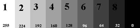
At the other end of the scale, patch 8 should be just visible. Patch 9 and patch 8 should in fact be so dark that it will be hard to distinguish between the two without staring for a few moments before you notice the "8" imprinted on the very dark gray field of patch 8. Patch 9 is the maximum black. If patch 8 and 9 are easily and clearly distinguishable (and muddy looking), the brightness is set too high.
Contrast
Contrast should be set between 50 and 75 percent of maximum. The last two (black) patches (numbers 8 and 9, above) should yield a very minimal difference in tone. Make adjustments of contrast until there is just a tiny difference between patch 9 (solid black) and patch number 8.

Now check the whites with the scale directly above. This scale grades patch 1 to patch 2 into 10 smaller increments (Mosaic will show only 4). Setting the contrast too high will loose some of the fine gradations near the bright end. You may need to go back and readjust the brightness.
Discussion
There are pages and pages of discussion on this topic at w3.org, but things won't get any clearer unless you have a degree in Physics. Most of the talk is about monitor gamma, but as yet browsers cannot adjust this.
Additionally, a graphics file may not even look the same on the same monitor during different times of the day, for the ambient light will effect viewing a lot.
In my case, graphics files created at night under incandescent light, often disappear into a vapor when viewed in the afternoon of the next day with sunlight streaming in the window.
But that is your problem. I'm sure if you have to squint to see what's on the screen, you should know enough to draw the curtains against sunlight.
Most of the W3 Consortium's discussion seems headed in the direction of having them control our screens with new forms of Jpegs, and new monitor and browser designs. Good luck. If you can't wait, follow these instructions.
Color
Color can be a real problem. First, if you can adjust the overall color temperature of your monitor, select a lower value, rather than a higher value.
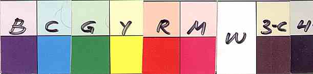
If you have an old or out-of-whack monitor, try the above patch as a first check for color adjustments. These are the separation colors, and printing primaries. The B is "True Blue," a dark purple blue, also known as "Kodak Blue." The rest are Cyan (Printer Blue), Green, Yellow, Red, Magenta (Printer Red), and White. The "3-C" is a dark brown (100% of Cyan, Magenta, and Yellow, in the printing industry), and the "4" is Black, that is, all three colors plus black added (thus "4 color" black).
You may prefer to use a well known image file instead, especially one with skin colors, like a person's face. Different viewing programs will give different results. Try a number of them, but don't use something like Photoshop or Paint Shop Pro, for if you have already adjusted the gamma for these, it will not apply when you switch to a browser. Better to use Netscape directly. I use vpic.exe (a DOS graphics viewer), for there are no controls, and it does a bang-up job of presentation.


Adjusting Color
Set up another monitor, it you have one, to make comparisons against, for the eye easily and very quickly corrects for color cast. Use the same viewing utility on both monitors.
To make the color adjustments find three tiny adjustable rheostats next to each other at the back of your monitor, usually mounted on the socket board of the tube.
You have to take things apart to do this. And you should know that you can get electrocuted. The voltage on the side of the tube is on the order of 20,000 volts, and will remain as a static charge for hours after the monitor is turned off. So be careful. I usually wait 24 hours after shutting down a monitor before opening up a monitor case.
Make the adjustments to the three wheels with a non-conducting rod (called a "diddle stick" among TV repairmen). You can carve the end of a lollipop stick into a screwdriver surface, or use a thin wooden dowel. Don't use a screwdriver for may effect the values, and you may connect electrically to the circuitry.
I like a diddle stick which allows my hand to remain 12 inches away from the innards of the monitor.
Note or mark the rheostats with their initial value with a marker. Then if you get things totally screwed up, you can always get back to where you started. Avoid setting near the low or high end of the rheostats. Make adjustment gradually, and use common sense: the composite color of a face is the sum of basic red, green, and blue colors.
It should also be noted that some monitors will drift in color values, that is, the colors will vary with time. If you know this to be true, have the monitor turned on for some time before making the adjustments. If you can afford to pay for the electricity, leave the monitors on all the time. They will not only be more stable, but they will last much longer.
landscape image by Jim Hugunin, 1972
gray scale by Stouver Graphic Arts, nd
color chips by Kodak, whenever
faces from the Usenet
 Aesthetic Investigation
Site Host: Counterpoint Networking Inc,
URL: http://jnocook.net/monitor/index.htm